Bathroom Sign Redesign
|
For our first project of the year, we were tasked with redesigning bathroom signs to be more inclusive that could be featured on our campus.
This might seem like a simple task, but it most definitely was not. trying to make a bathroom sign that was not sexist, readable, and artistic. It's safe to say we all were scratching our heads. However, with a bit of patience and a lot of scrapped sketches, I finally settled on a design I decided to design them with bears in different styles! I used the Sanrio style for the women's sign, since it's also the style for Hello Kitty, a very traditionally feminine character. I used a realistic style for the men's sign, since it was a bit more "to the point", like how many men (improperly) envision themselves. Lastly, I used the style from We Bare Bears, a popular Cartoon Network show, for the gender-neutral sign, since many non-cis individuals are, at very least, familiar with it. Many absolutely adore the show, so I thought it would make a bit more sense to them than men or women. The reason why I decided to use these designs is because, as an arts school, we should embrace different styles. Although styles themselves aren't gendered, they all have the sort of aesthetic you'd imagine for women, men, and non-cis people. I chose bears because I knew about the Sanrio bear and We Bare Bears, and thought they would be good designs to imitate. Bears also have a sort of gender-neutral association. Sure, they can be manly, strong, and gruff, but they can also be silly, sweet, and motherly. I was planning on switching over to doing lions, but Mrs. Tancredi said a lot of people were doing lions already, which would make my designs less unique compared to the class. Therefore, I stuck with bears. I'm glad I did anyways, they turned out pretty well. I decided to use blue as the general color palette. It's a fairly gender-neutral color, if you think about it. Making them different colors would also bring up the association of those colors with the specific identities, so a monochromatic palette would help combat that. I did, however, use different values. I used light blues for the women's sign, dark blue for the men's sign. and a saturated blue combined with light and dark blues for the gender-neutral sign. Also, I really like the color blue. The results ended up really good, especially for my first few pieces using Illustrator. Fiddling with the controls got annoying, but I made it through! |


|

|
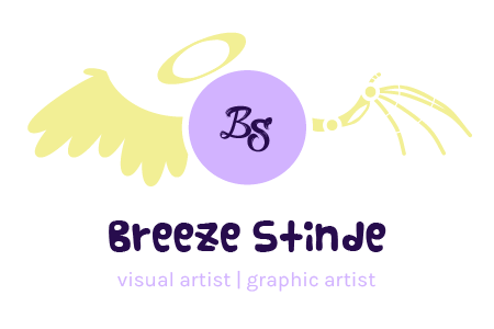
Artist's Logo for Business Card
|
This project, although tedious and occasionally frustrating, was very fun.
The design of the halo and wing were directly inspired of the art persona featured on my headers, and I have a few pieces featuring this character in my personal works and my portfolio. The design came very easily to my mind, and so it didn't need much sketching done before I moved on to Illustrator. Later on, when I chose the font, I went for a very stylized, handwritten-ish font that looked decorative but authentic. I briefly considered a more cutesy font, but i felt like it didn't fit my personality, and so I switched back to the original font. The actual construction of the wings was difficult, because Illustrator is kind of finicky to me. The bone wing easily took me a week. However, after hours of effort, I got the bottom logo. I quite liked it, but I decided to consult with Mrs. Tancredi. With a bit of guidance from her, I got the top logo. At first, I still preferred the original design, but after a while, I really fell in love with the revised logo, which is now featured at the top of this website. Now, we are ready to design our business cards! |
|
|
|
|

|
Business Card
|
Using the logo from the last project, we made our own business cards! To be honest, this business card frustrated me a lot. I probably spent a week or so just trying to crop the frickin' art piece. I also went through a few different versions, but ultimately settled on these two. I chose two because I didn't want to restrict myself to one or the other, and I honestly like both of them (although I think I slightly prefer the vertical version). I would feel proud if I handed one over to someone interested in my art.
|
horizontal version
|

|
vertical version

|

|
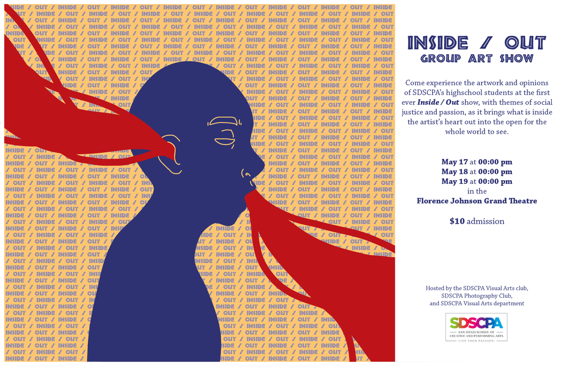
Inside-Out Poster
|
For the Inside Out poster, I wanted to show a sort of flow in and out of an artist. This was surprisingly tough, due to the way layers and objects work in Illustrator. Things wanted to layer over things they shouldn't, any object poking out of the edge of the working space wasn't deleted. I actually also had trouble formatting the text in the background.
I decided to stick with a simple primary trio color scheme, but giving the yellow and blue slightly warmer tints to make it more cohesive. I thought the combination of a decorative title and a serif font gave the give of an artsy but sophisticated show. |
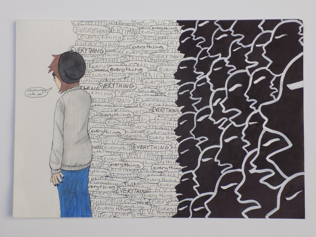
Inside-Out Piece
|
This piece was made to highlight the bullying I faced in middle school, and how it affects me today. The dialogue shown in the piece is reminiscent of one particular instance of bullying, in which I screamed, "What's wrong with me?" only to be answered with "everything", for that time and repeatedly throughout the year, when my bullies would follow me around, haunting me with that word. In this piece, I show how that time still kind of haunts me today, and I still feel sometimes that people talk about me behind my back and still don't like me, even though I've changed and grown since that time.
|
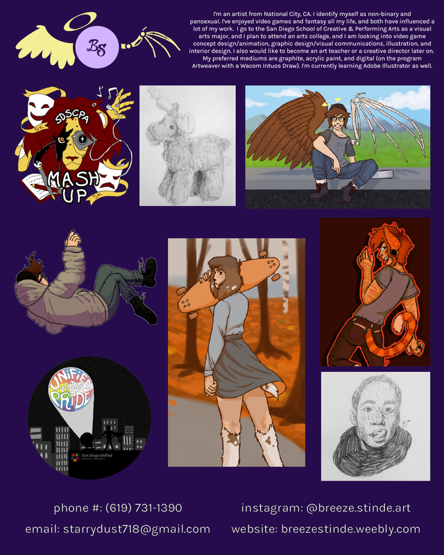
Promotional Poster
|
For this poster, I used an array of different pieces, from shirt designs I've made to digital drawings to traditional sketches. Their differing shapes and sizes made them a bit hard to place, and I had to do a lot of moving around to achieve this composition, but I'm fairly happy with the result. I used my color scheme and my website's ...
|
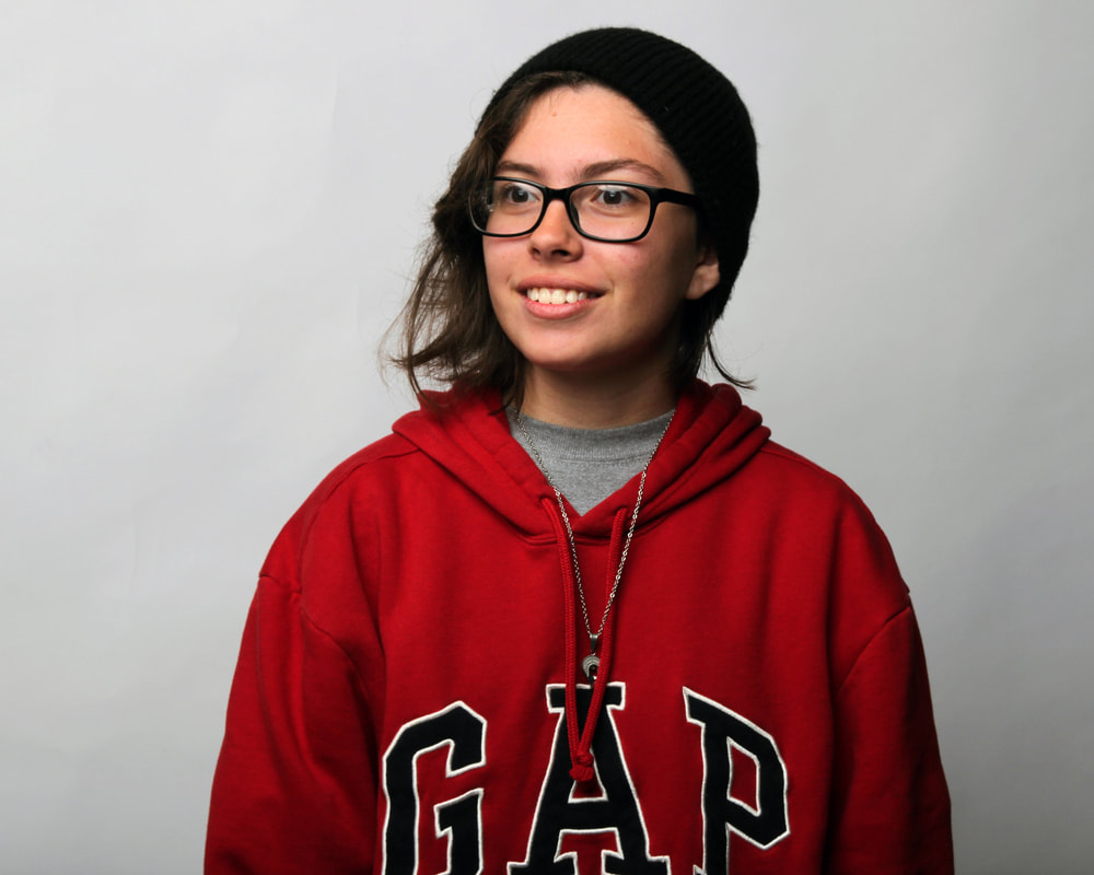
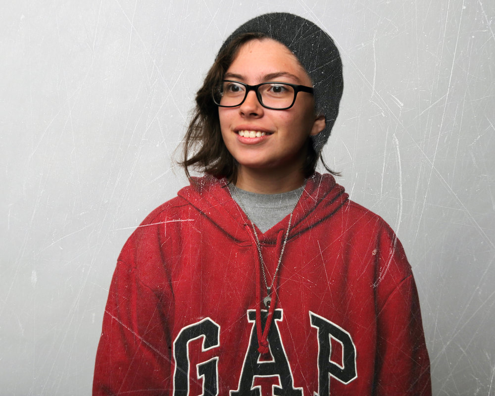
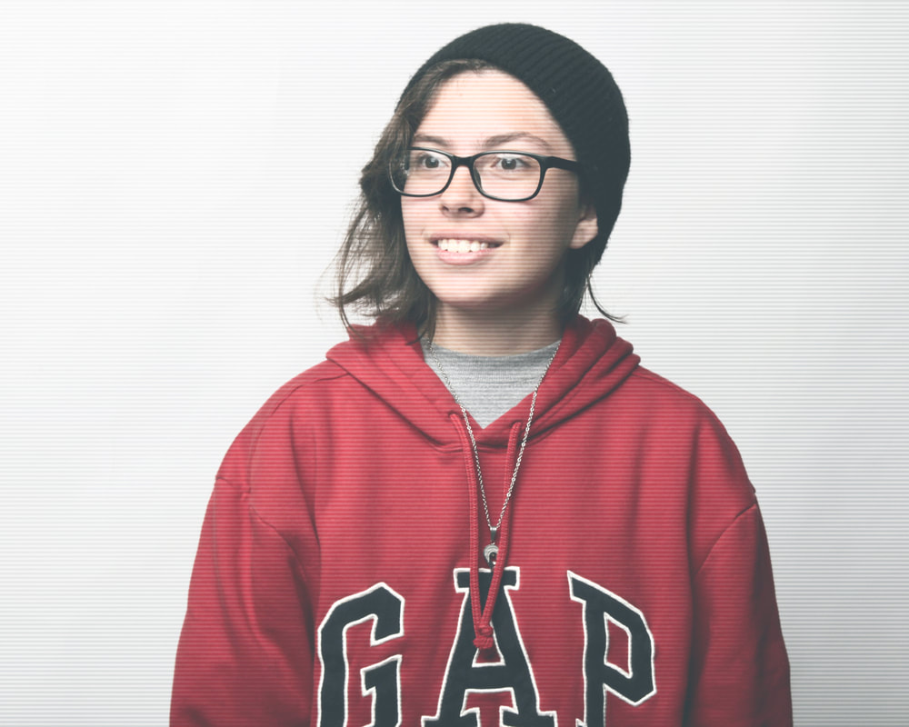
Portrait w/ Filters
|
wip
|
|
wip
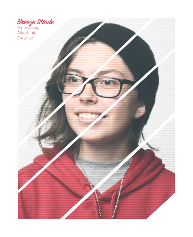
Magazine Cover
|
